
A gradual but inevitable descent into cricket-based loathing and bile.
Revenge Of The Wiggles
Way back in November of last year we put together a fairly pithy Scorer’s Notes piece entitled The Wiggles: England’s Lower Order Hot Potato. This was largely an excuse to demonstrate a new type of chart (the so-called wiggle chart), while also pointing out that Stuart Broad and Tim Bresnan’s batting and bowling had gone to shit. Even by the standards of 51allout articles, it was distinctly unsuccessful (comments: none; retweets: none; appearances in Wiggle news (an online daily collection of news stories about the Wiggles): just two).
It was clear from this staggering lack of reaction that we had made a terrible, terrible mistake. Like that time we tried to blag some free gin on Twitter and just ended up receiving loads of (for once undeserved) xenophobic abuse. Our mistake in this case was underestimating our audience.
The readers of 51allout are, without exception, very clever people. Now that is scientific fact. There’s no real evidence for it, but it is scientific fact. Hence the simplistic nature of the year by year wiggle chart held no appeal whatsoever. ‘Give us cumulative charts so that we can see exactly what’s going on, you shits!’ the people would almost certainly have told us, were it not for the fact that our email thingy didn’t seem to be working that day. Or our twitter. Or the phone, although that might be due to us not paying the line rental for well over a year.

Shane Watson practices his indifference face, just in case the opportunity to use it came along in the near future.
Anyway, those imaginary cries have now been well and truly answered as we look at the cumulative wiggle charts of some of the great allrounders. And Tim Southee.
Even though the charts themselves may look like something Jackson Pollock might have discarded for being a bit too avant garde, there’s actually an awful lot of information in there. It just needs someone to stare at them for ages in order to draw it out. It’s like those magic eye things that were popular a while back, until everyone realised that they were shit. But, er, not shit.
The basic concept is relatively simple. We track a player’s batting average in their Test career to date on the x axis. We also track their bowling average on the y axis, although this has been inverted (so that zero is at the top), to reflect that a low bowling average is good. We create a data point for the end of every match and stick them together with a line, which we’ve coloured by year. The gist of this is that moving towards the top right is good, while moving towards the bottom left is bad.
As always, it’s much easier to explain these things with an example. And here’s one, namely the Test career of one Stuart Broad:
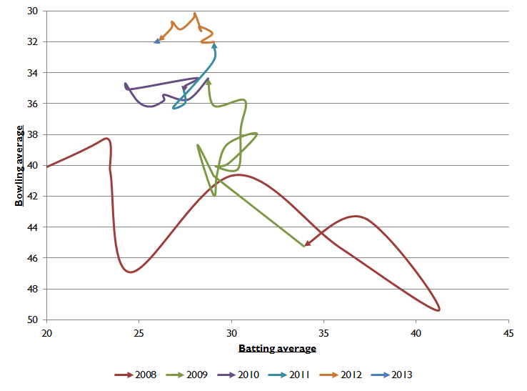
So what does this tell us? Firstly, it is possible to drink too much gin during chart development sessions. Secondly, Broad’s career has lurched around all over the shop. Back in 2008 his bowling average wobbled around the high 40s, while his batting average reached the heady heights of 41.22, very close to Michael Vaughan’s eventual career average. From 2009 onwards the batting regressed somewhat, down to around the 30 mark (i.e. the line gradually moving left), while the bowling improved from 45 to around 35 (the line gradually moving up). 2010 was a year of consolidation before in 2011 Broad blitzed through India, taking 25 wickets in the series to drag his bowling average back down to 32. And 2012 saw that improve further (via a personally successful series in the UAE) before being dragged back via some beatings at the hands of the South African and Indian batsmen.
So what have we learned? Mainly that Broad’s batting has been going gradually backwards since 2009, even as his bowling has improved (at least until his most recent performances). The days of him being touted as a Test number seven (or even six) are long gone. He’s now a decent number nine, with a penchant for missing straight balls at the start of his innings. It’s important to remember this every single time his selection is justified in terms of his batting.
The next victim of the Wiggles’ lust for the truth is non-homeworking Australian perma-crock Shane Watson. The official line is that Watson will no longer bowl, instead focusing entirely on his batting (although certain members of the 51allout crew have bets on whether this will remain the case for long, plus there’s the small matter of him being kicked out the side for not understanding how to use PowerPoint). This non-bowling malarkey probably isn’t a good thing, as his chart will testify:
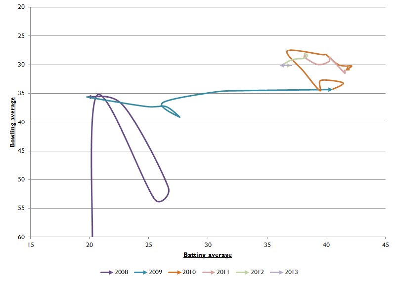
What this shows us is that Watson’s career has been almost entirely built on two steps forward and three steps back. After a dodgy start (in 2005, which is chopped off the chart here, and 2008), 2009 saw him get his batting average up to a respectable level. Since then though, it’s been a constant struggle to push on with the bat, with that average gradually heading backwards since the end of 2010.
The ironic part of this, like that time we needed a knife and all we could find in the supermassive 51allout cutlery drawer was ten thousand spoons, is that Watson’s bowling average has always been more than decent. If he has now permanently given up with the ball then he needs to be judged on his batting alone. Unfortunately for him, the chart above is really that of a bowling allrounder, even if no-one in Australian cricket seems to appreciate this. To play devil’s advocate, would England look twice at Chris Woakes for their Test side if he decided to give up bowling?
No further questions, your honour.
Last but not least: Tim Southee. Not because we have anything all that insighful to say about him, it’s just that we’re starting to get very excited about him and his performances. Hopefully one day he’ll get on board the Pune Warriours gravy train (he’s currently one of about ten cricketers around the world who aren’t contracted to Pune) and we’ll have Southee, Luke Wright and Steve Smith in the same team. We’d literally weep with excitement if that happened.
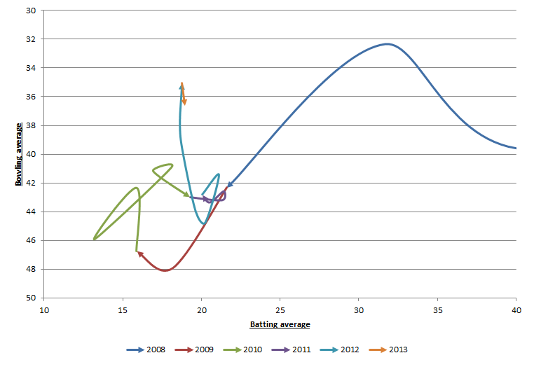
In terms of his chart, we can see the different steps of his career quite nicely. In 2009 things went a bit off the rails – he added six runs to his bowling average while losing four off his batting. 2010 and 2011 saw him fight back to where he’d started before 2012 saw him begin to fulfil his potential, with that brave arrow heading off towards the heady heights of a sub-36 bowling average. His batting’s still a bit shit though.
Now the race is on. Will anyone actually be able to understand this article? Will it outperform its predecessor? (Comments: none; retweets: none; appearances in Wiggle news (an online daily collection of news stories about the Wiggles): just two) Only time will tell. But at least we’ve definitely done our homework, which these days is more important than ever.
Latest Poll

3 Comments
Post a Comment
1
Nichael Bluth
20 May 2013 01:49
Mission accomplished.
2
wrong’un
19 May 2013 11:30
As a mathematician and a cricket fan, those graphs are actually amazing. I don’t know what to make of them in the slightest, but I know I love them.
3
Alex
12 Mar 2013 22:09
I’m not really a huge fan of the colours you wiggle with. Perhaps a dark green would be a good contrast colour?
Also you could go for a bit of consistency with what colours represent which year. For example, in the different wiggles orange represents 2012 then 2010 then 2013.