A gradual but inevitable descent into cricket-based loathing and bile.
Nick Compton And The Bradman Gap
With the England Test squad to tour India now announced, the obvious question is around how the batting lineup will look for the first Test in Ahmedabad, in the middle of November. With the Kevin Pietersen debacle now 100% definitely consigned to the past like an episode of Bucky O’Hare, England finally have to move on from internal squabbling to actually trying to score enough runs to give the bowlers something to work with. In order to try and do this two new faces have been added to the squad: Joe Root and Nick Compton.
Despite joining the squad at the same time they are two players at very different points in their careers. While Compton has been rewarded for a fine season at county level in which he topped the national averages, Root has been picked almost entirely on potential. At just 21, he’s ridiculously young. It’s highly unlikely that he’d remember Knightmare for a start, given that he didn’t turn four until six weeks after the end of the final series. This is a disturbing fact on so many levels. Also slightly disturbing is a First Class average of just 38; purely as a point of reference, comedy Australian outcast opener Phil Hughes has a First Class average just above 45. And yet, in the absence of many options, England have identified Root as a potential new opener. If they’re determined to keep Jonathan Trott at three (not the worst idea in the world) then Root could come in to replace the now-retired Andrew Strauss.
The other option (obviously) is to bring Nick Compton in somewhere. He’s generally batted at three for Somerset but has opened and batted in the middle order in the past and therefore offers a number of options. And it’s his statistics over the recent county season that we’re particularly going to focus on.
Less talk, more charts
Before we get to the charts, it’s worth having a quick think about the different measures that we look at, particularly the relationship between runs scored and batting average. On the surface of it, it’s fairly straightforward: lots of runs scored = high batting average. But there’s a general distinction about which is the best way to determine what we’ll arbitrarily call ‘quality’.
When we look at a small sample (i.e. a handful of innings), the number of runs scored is usually the better way to determine quality. To use an example, in the recent Test series against South Africa, Matt Prior’s 275 runs (at 45.83) are more impressive than Graeme Swann’s 100 runs, despite the latter being at an average of 50.
Conversely, when we look over a longer period of time the average becomes a lot more significant. Alec Stewart’s 8,463 Test runs (at 39.54) is an excellent total but only a drunkard, perhaps one passively drunk from sitting next to Tony Greig for an extended period of time, would suggest that he was a better batsman than someone like Ken Barrington (‘only’ 6,806 runs, but at an average of 58.67).
Why do we bring this up? To be honest, it’s mainly to set up a cheap jibe about Tony Greig’s commentary box habits. But also because the County Championship season falls into the awkward gap between a ‘small’ and ‘large’ sample size. But we’ll talk more after a chart (and remember you can click on the image to see it in full big-o-vision):
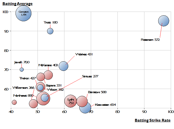
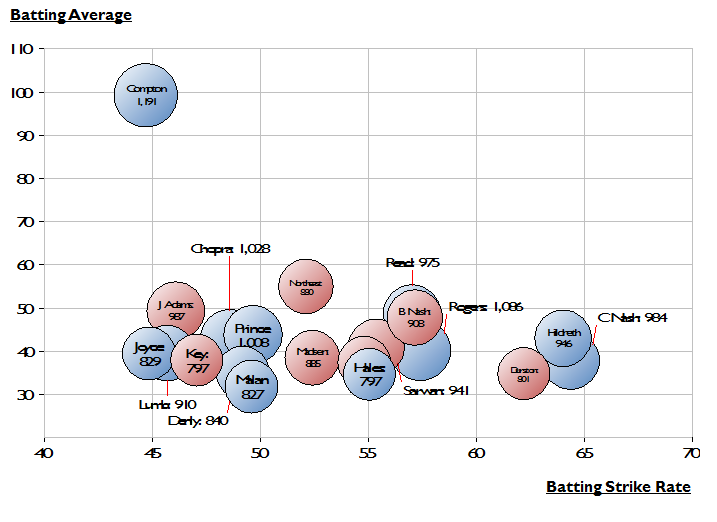
Firstly, it’s important to mention that bubble charts are cool, no matter what anyone else says. On this particular one we’re looking at three different dimensions, all referring to the 2012 County Championship season: on the x axis we have batting strike rate (runs per 100 balls), on the y axis we have batting average and on the z axis (the bubble size) we have the number of runs scored. Just because we can, we’ve also coloured by division, so that the top flight players are all blue and the second division red.
We’ve included the top 20 run scorers here i.e. those with large bubbles (no sniggering at the back) and one thing is very clear: Compton stands out by a mile. The likes of Read, Rogers and Hildreth also scored around 1,000 runs but at an average of between 40 and 50, whereas Compton was fractionally below 100. This (massive) gap between the top batsman and his contemporaries is very similar to the Bradman/every other Test batsman difference, albeit over a much smaller timescale. It also effectively forced the selectors’ hands; to not pick Compton now would effectively be to condemn the county game as a waste of everyone’s time.
Something interesting to note – of those top run scorers, Compton is the slowest, going at just under 45 runs per hundred balls. This isn’t anything revelatory – he scored 1,010 runs in 2011 at a strike rate of 46, plus scored only 42% of his runs from boundaries (compared to 51% for Rogers and 53% for Chopra) – but it does reinforce the general consensus that he has the mindset and technique for Test Cricket.
Lies, damned lies and statistics
Of course, as we discussed earlier, looking at the top run scorers alone doesn’t give us the full picture. In particular, it favours those who simply played more games over the period that we’re looking at (i.e. those that weren’t injured, called up by England or thrown out of their team for being a complete egomaniac). So we can do a similar analysis for those with the best averages instead:
 And it’s here that we get some very interesting results. Sitting next to Compton is Jonathan Trott, a man with a very similar approach to scoring runs. Over on the far right is Kevin Pietersen, a man with a very different approach (but equally successful results). And then there are a few familiar names. Both Bairstow and Kieswetter were in and out of the county game, being in (and out) of various national sides across the different formats, while Chris Woakes had a fine personal season after overcoming injury problems. Indeed Woakes’s lack of international progress – he’s not in any squad for the winter at all – is somewhat baffling.
The other name that jumps out is Adam Lyth, Joe Root’s opening partner at Yorkshire. With 751 runs from just 15 innings, his average of 53.64 is comfortably superior to Root’s (43.41). Plus he is naturally more experienced – he would have been seven at the tragically early conclusion to Knightmare in 1994. So the question of why he was overlooked in favour of Root is a difficult one to answer. However, it’s at least consistent with the England Lions selections earlier in the season, where Root opened with Chopra and then Compton against Australia A and perhaps reflects on a difficult 2011 season for Lyth where he averaged just 26.
In conclusion
It’s reassuring to see several of the England players in the second chart – even Ravi Bopara and Andrew Strauss are in there – as it suggests that they’re at that level above the majority of county players on their occasional visits to domestic cricket. And the position of Compton creates a compelling case for selection (compared to a disappointing season for James Taylor at county level coupled with a far from Earth-shattering start at Test level). But it’s Joe Root’s selection that is the most controversial. Good players have emerged from average First Class records before – Marcus Trescothick and Michael Vaughan being two recent examples – before it’s hard to find any evidence to truly argue his case. Indeed, it’s his absence from both methods of ascertaining the ‘best’ county batsmen that is the true finding here.


1 Comment
Post a Comment
1
D. Cameron
15 Oct 2012 20:31
It’s good to know, that whilst we are drowning in a sea of Jimmy Saviles’ rapeyness, the good, honest pastime of cricket is there to distract you…
Plus, I really like charts.