
A gradual but inevitable descent into cricket-based loathing and bile.
Making A Contribution
In one of our occasional dabbles into making up numbers, drawing charts and generally wasting everyone’s time, we looked at the concept of ‘contribution’ to assess a player’s worth. While a player’s quality is always open for debate (except in the case of Bryce McGain, who is universally regarded as useless), their contribution is recorded in hard and fast numbers; in terms of runs scored, wickets taken, catches and stumpings. And, having used that to look at the most important players in last season’s county championship, we can now use the same principle to work out who is most (and least) responsible for England’s current shitness.
The principle is really simple: each run scored is worth one point, each wicket 20, each catch five and each stumping ten. So for Simon Kerrigan’s debut at the The Oval, that’s one point for his epic 1* in the first innings, no points for 0/53 from eight of the worst overs we’ve ever seen and no points for fielding. Given that England’s XI scored 548 runs in the match, took 15 wickets (300 points) and 10 catches (50 points) that gives Kerrigan a contribution of 1/898 or 0.11%. Truly one of the great debuts.

Perhaps surpassed only by this.
All we are doing is calculating that contribution percentage for each player and showing it for each match (and also a series total). Let’s start with a series that was actually enjoyable to watch:
Home Ashes 2013
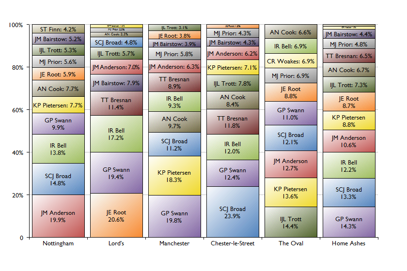 There’s a lot of information in this chart, which we’ll approach in the ‘close your eyes and hope for the best’ style of the aforementioned Simon Kerrigan:
- Jimmy Anderson’s epic performance in Nottingham (with match figures of 10/158) was actually followed by very little in the next three matches.
- Stuart Broad’s performance at Chester-le-Street was remarkable, contributing nearly a quarter of everything England did, almost twice as much as the next ‘best’ player, Graeme Swann.
- Jonathan Trott was actually England’s top performer at the Oval (scores of 40 and 59, two catches and the wicket of Brad Haddin), largely covering up his lack of contribution to the first four matches.
- Over the course of the five matches, Swann, Broad, Ian Bell and Anderson contributed just over half of England’s total contribution between them. Kevin Pietersen was in fifth, only just ahead of Joe Root, despite the latter getting a bit of a shoeing for his rubbishness.
- Alastair Cook contributed only slightly more than Tim Bresnan, despite our favourite B&Q employee only playing in three matches.
One thing that does leap out at us from this chart is that it really emphasises how one-dimensional certain players are. Monty Panesar has often been beaten with that particular stick, but it applies just as much to Kevin Pietersen – assuming that being an annoying c**t isn’t a second dimension. If he’s not scoring runs then he doesn’t bring anything to the side. At least the likes of Cook and Trott are close catchers, while Pietersen generally grazes around the outfield like a cow with a vastly over-inflated view of itself.
Away Ashes 2013/14
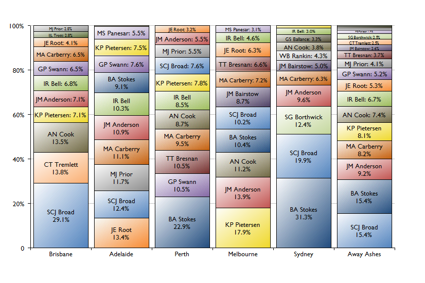 There’s an important context to this chart, which is that all of these matches contained truly terrible England performances. As such, the outstanding individual efforts (Broad in Brisbane, Stokes in Perth and Sydney) were all more King Canute trying to turn back the tide than Botham ’81 match-winning epics. Across the series, it’s those two that stand out by a long way, particularly when we consider that Stokes didn’t even play at the Gabba and yet only marginally missed out on top spot overall.
After Broad and Stokes, it’s a pretty sad tale: Anderson only really contributed in Melbourne, ditto Pietersen. Indeed, KP was England’s least effective contributor in Sydney, the match during which Paul Downton accused him of being an annoying c**t (albeit not in quite such a direct way). Scott Borthwick being England’s third biggest contributor in his only match pretty much sums the whole sorry shambles up.
Home series vs Sri Lanka 2014
There isn’t all that much that can be drawn from a two match series but we’ll stick the chart up and then draw two quick conclusions.
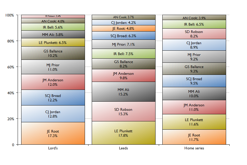 Those conclusions:
- Liam Plunkett is ace.
- Alastair Cook is fucked. Unless he carries on reinventing himself as a bowling all-rounder.
Latest Poll

3 Comments
Post a Comment
1
Brian
15 Jul 2014 22:42
Gavin Hamilton should thank his lucky stars that you’ve only just come up with this method.
2
Nichael Bluth
15 Jul 2014 04:50
Yes, there is that.
3
Matthew L
14 Jul 2014 17:47
Much more of an even spread in SL series seems healthy, ie, everyone is pulling their weight (except Cook & Lord Bell)
Of course it could also indicate they are all equally shit